So I started drawing the stormy landscape and it started storming. It thundered so loud the windows rattled. I’m kind of afraid now. I might try again in a few days maybe. I’m shaken by the whole experience. In the meantime, I drew this a few weeks back and never got around to sharing it. The girls hand didn’t turn out quite right but I’ll have to live with it.

It’s much harder than you’d think to draw your own fear, isn’t it? It may sounded twisted but for me it was terrifying yet fascinating at the same time. Take your time with this one, I know you’ll do an excellent job on it.
Oh and btw, I love your latest sketch, it’s really cute.
This probably isn’t what you were expecting but it was the best I could do and the only decent thing I could come up with.

Lol, well seeing as how you despise drawing landscapes and have a fear of storms, I wasn’t expecting Picasso or anything. I do still like it though, the fact that you actually took the time to draw this is good enough for me 
I have a fun idea. Kind of. I’ll let one of you decide how I color my next picture. Should I color it using pencil, charcoal pencil, colored pencil, crayons, markers or watercolors. The first person who says will be the one I use. I have a very limited amount of markers though so if that is chosen it probably won’t turn out well.
Charcoal pencil would be interesting.
Okay. I usually do my shading with charcoal pencil anyway.
Here is one picture drawn and shaded completely with charcoal pencils. I think it turned out pretty good. B)
Wow, that was much faster than expected. It turned out pretty good.
I need to catch up here, Forest!
Loved the girl in the beret. She is adorable! It reminded me a little of the song, “Raspberry Beret”.
I liked your couple and I’m not sure what you mean about the hand. It looks fine to me.
Your stormy landscape is good. It reminds me of something, but I can’t quite place it. It’s an interesting way to face your fear though. I know it was hard for you, but you did a good job!
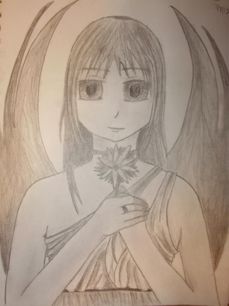
Your angel is beautiful. Love the shading!
Keep up the great work!
I echo the powerful yet enchantingly beautiful Mistress. Forest, you have been doing some awesome work. I really see your experience growing. Keep the lovely surprises coming!
Ok, well. I’ll get started on what Forest has been waiting to hear. The criticism. Don’t worry though deary, I won’t be too harsh
So, I wanna talk about the winged woman. I really like the composition overall, but there are some areas that its lacking in. For example, the wings could have a little more detail to them, like adding texture to them would be really nice. Also, her skin is a little too blank. It would look better if you drew form shadows on her skin and added a little bit of shading to her skin to give it more of a 3D look as well. I do love how you’ve been improving on clothing though, that’s always been a weak point of mine so I’m a little jealous. And like I said, I love the overall idea of the artwork. And now marks the end of the first artistic criticism you’ve been looking for.
-The Magnificent Oracle
(I’m just being cocky, don’t mind me ^_^)
Well thank you Oracle. I agree about the skin I have been working on that but I have a hard time with it because I’m afraid I’ll mess up the skin to easily. I also agree on the wings. That was the last thing I did and I was getting lazy and my mother was yelling at me for something or other and I just wanted to finish. How would you recommend I add texture to the wings? Like just but shading more or something else?
Well it depends on what kind of texture you want, if you’re looking for softer, then yes more shading and more importantly, more constrast from the different shades should be applied. And if they’re more like bat wings, which is kinda what I see them as, I want you to add more contour lines. For those of you who don’t know, contour lines are the lines that make up the inside and outside shape of an object. Anyway, adding more darks, highlights and more contour lines would give it more of a smooth, leathery look, like bat wings. Secondly, don’t be afraid to go darker with your shadows, the more the highlights and lowlights contrast, the more realistic the art looks. The most important thing to remember with pencil/charcoal pencil is dont be afraid to experiment with darks and lights because pencil is a forgiving medium, unlike colored pencil or paint, pencil is the sole medium that can be erased.
Love the work Forest, it looks great!
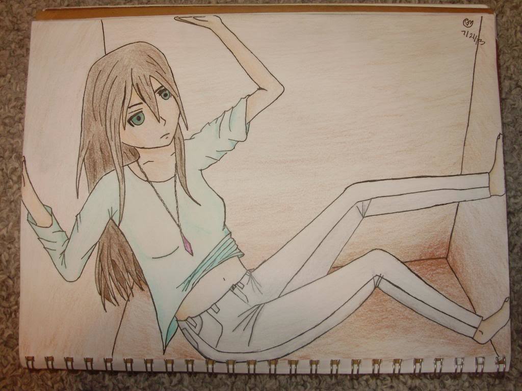
Considering that I drew this while I was in a moving car it came out okay. The lighting in my room made the picture look a little washed out, the colors were much more vibrant than that but oh well. Girl in a box.
Nice work, Forest! Good idea too!
It’s amazing! But one thing that’s really nagging at me is the face. It looks crooked and from my perspective, it’s the jawline and mouth that make it look crooked. At first, I thought it was the eye that looked off, but at a second look, I realized that the eyes and nose were perfectly aligned and it’s actually that the mouth and jaw are off center. Try to work on that the next time you draw a face at this angle. Also, more form shadows on the shirt would have have it a bit more depth, remember that. I love the idea though, and the shading on the box and around the girl is amazing, you’re improving by leaps and bounds every time you post something new. I’m very impressed, keep it going, Forest.
So I was going though my desk and I found a box of crayons that I haven’t used in years. I thought it might be fun coloring a picture with them since I generally only use pencils. So this was completely just for fun because I was bored. There is no shading or anything but its so pretty I just had to share it.
